Sunovion
Pharmaceutical company Sunovion needed a brand that could help make good on its promise to lead the way to a healthier tomorrow. By elevating its corporate brand, Sunovion would further boost its product brands; it would also raise awareness among doctors, patients, employees and the sea of biotechnology talent congregated in Cambridge, Mass. a mere 30 miles east.
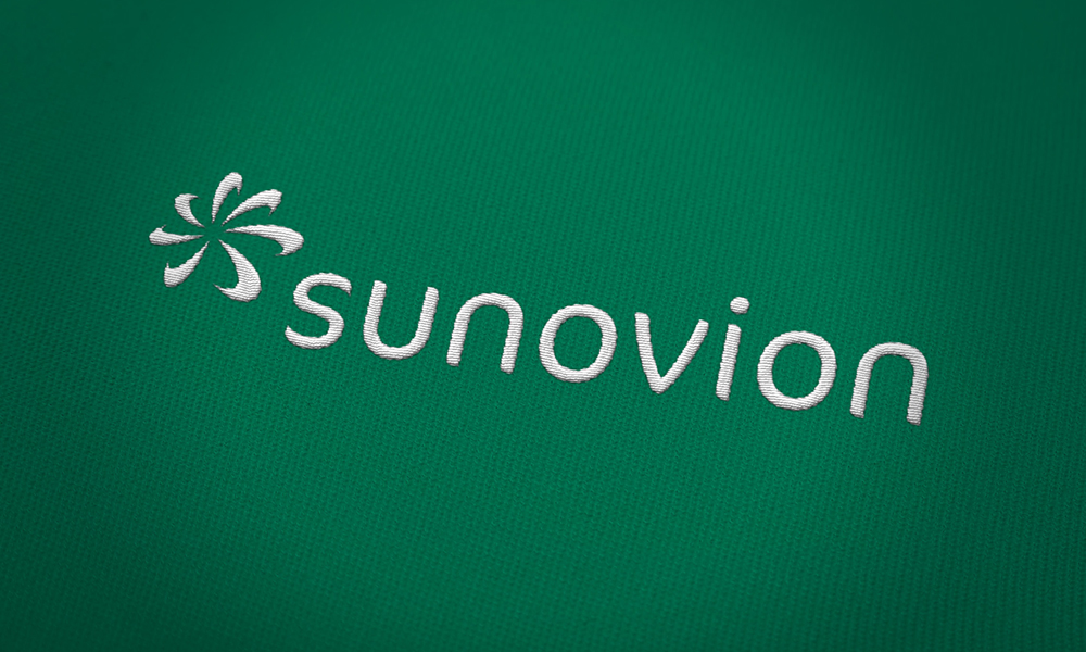
Along with a reputation for innovation and integrity, Sunovion inherited an outdated logotype and design system from Japan-based parent company Dainippon Sumitomo Pharma’s (DSP). More streamlined and legible for a global audience than its predecessor, the new logotype has curvilinear forms and tapered ends that visibly connect to the symbol, referred to as a prism. The lowercase signals a modern, progressive approach that’s a little less corporate, and a little closer to the patients.

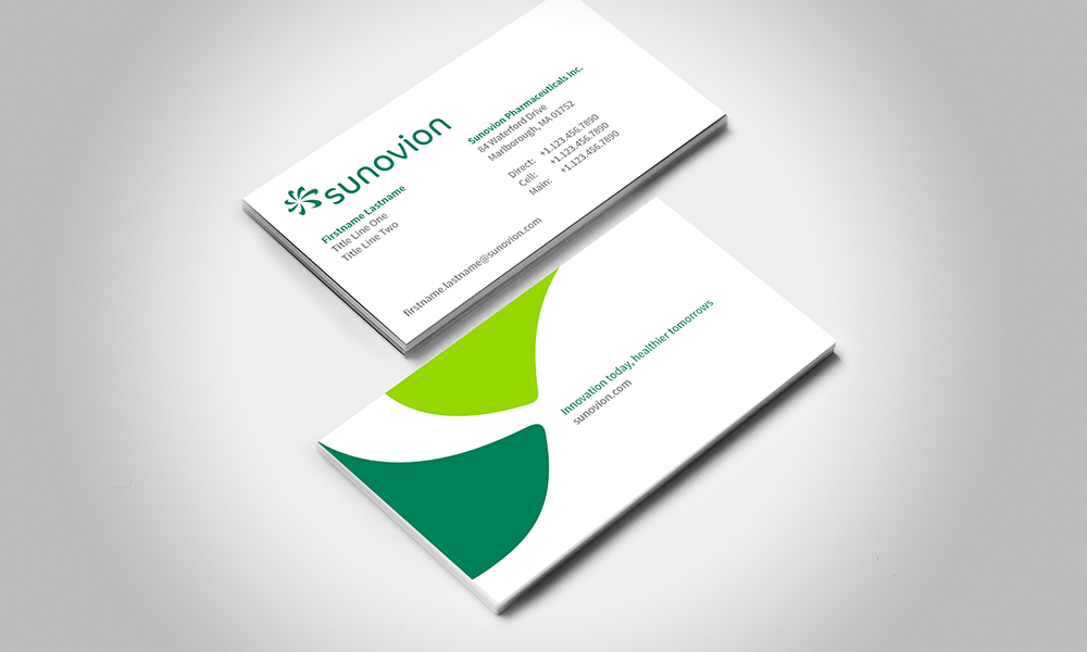
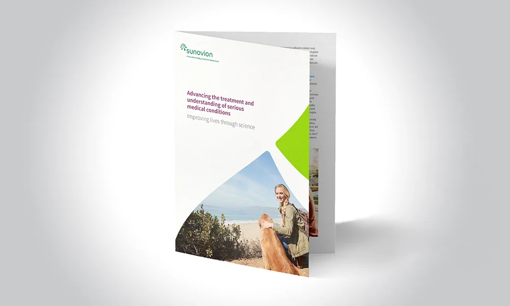
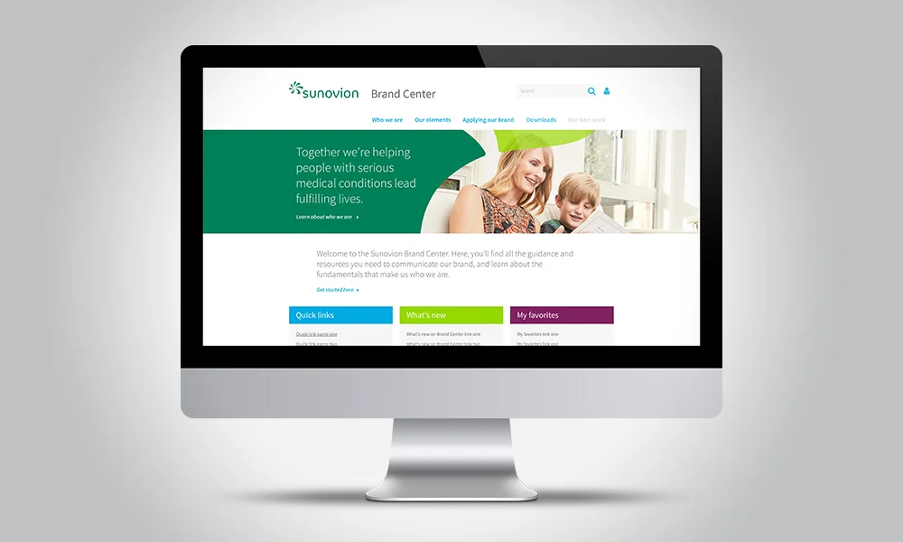


Sunovion did retain its original symbol, which served as the foundation for the entire design system in the form of "Movement shapes." Along with a vibrant color palette, ample white space and a custom photo library, the new visual identity truly represents the company's human, dynamic and collaborative nature.
Client: Sunovion Pharmaceuticals | Agency: Monigle | Senior Designer & Photo Art Director: Kristan Butler | Designers: Renee Tablot and Ann Masterson | Creative Director: Laurent Tschumy | Client Experience Director: Nicole Gerhardt | Strategist: Taryn Birch | Photographer: Bryce Boyer | Producer: Lisa Schrag